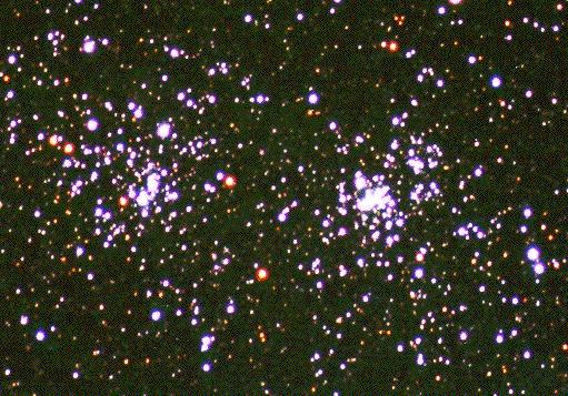
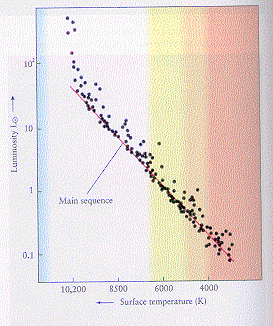
What do they look like? For open
clusters (like h and chi persei) we see a clear main sequence:
|
|
We can define a main sequence
turnoff -- a point where stars start to leave the main sequence.
What does this tell us?
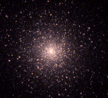
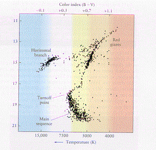
For globular clusters
(like M15) we see a very different kind of color-magnitude diagram:
 |
 |
We can use theoretical calculations of aging stellar
populations -- called stellar isochrones
-- to fit cluster HR diagrams and derive distance, ages, and metallicities
of star clusters:
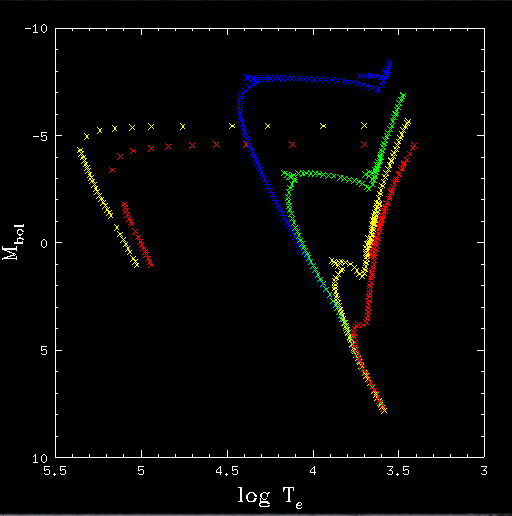 |
This is an example of a stellar isochrone, labelled
by color:
Don't confuse this with an evolutionary track, which shows the properties of a star as a function of age for a fixed mass! |